In coordination with the 20th anniversary rebranding of InLiquid, we undertook a large update to the visual front end of InLiquid.org. First and foremost was as shift in the tone from a dominant black accent, to a dominant white one.
Additional Major upgrades included:
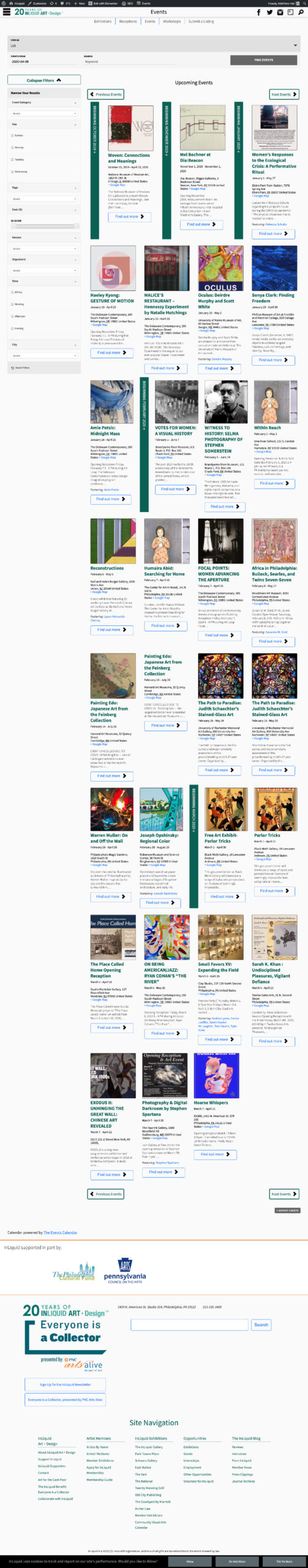
- Rebuilding the layouts for the community calendar to allow for better filtering and navigation of the extensive calendar that is supported.
- Updating the opportunities section to arrange by nearest deadline
- Changed functionality to archive exhibition spaces that are no longer current
- A new layout for artist page headers to move portfolios closer to the head of each page.
- A new previous/next navigation to move alphabetically through artist pages.
- Improved availability of the social media links across device sizes.
The live version of all changes is available at InLiquid.org.