At the onset of the redesign for the Beezix.com and launch of an amazon store, we decided to use the opportunity to update the visual identity for Beezix. The elements that continued for the visual identity were the base logo and a blended line motif that has been a part of the brand for some time. Each received different tweaks and changes to allow us to put forward a fresh look.


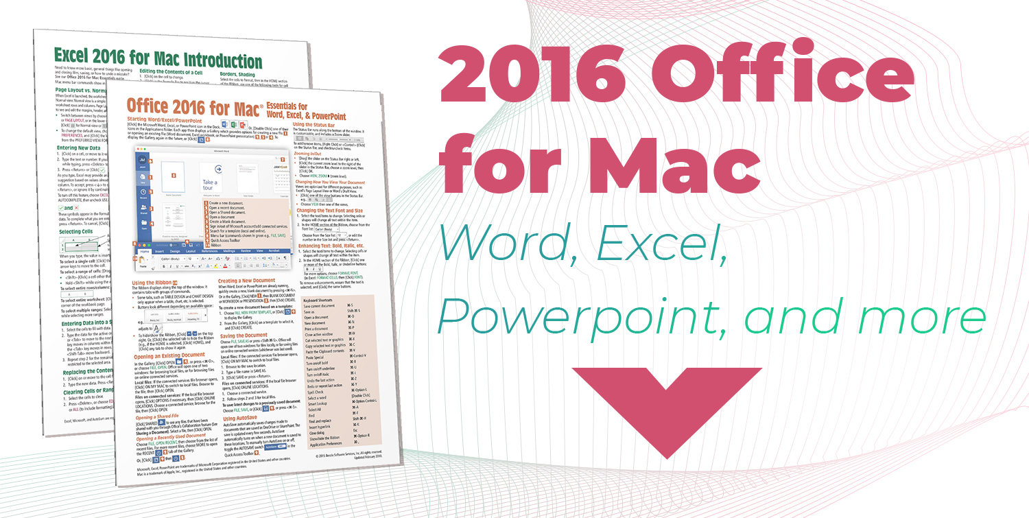


In addition to the presentation images, we decided to re-work how we displayed the card images. Previous card images had necessarily been flat views that only showed the first page, and visually did not indicate additional pages or page folds. With the redesign I was able to work in a 3d presentation that stands out more as a visual item that allows you to see the edges of the paper in a more real way as well as understand instantly how many pages each of the individual guides has.